Well guys we have made it to the end of this season of the One Room Challenge and it’s finally REVEAL DAY! I can hardly believe that this day has already arrived–the past 8 weeks have flown.

If you are a regular you’ve probably been following along with me on the journey to transform our living room from blah to awe, but if you are new and are swinging by from the link up, welcome! You can catch all previous posts from this season here:
- One Room Challenge (Week 1): Living Room Plans
- One Room Challenge (Week 2): The Fireplace
- One Room Challenge (Week 3): Beginning the Built-Ins
- One Room Challenge (Week 4): Built-Ins and Shiplap in the Window
- One Room Challenge (Week 5): Shiplap Wall
- One Room Challenge (Week 6): Board and Batten
- One Room Challenge (Week 7): Fireplace Mantel and Finishing Touches
I am absolutely smitten with how our living room turned out and I can’t wait to share it, but first let’s take a peek back at how far this room has come. This is what it looked like on move in day:
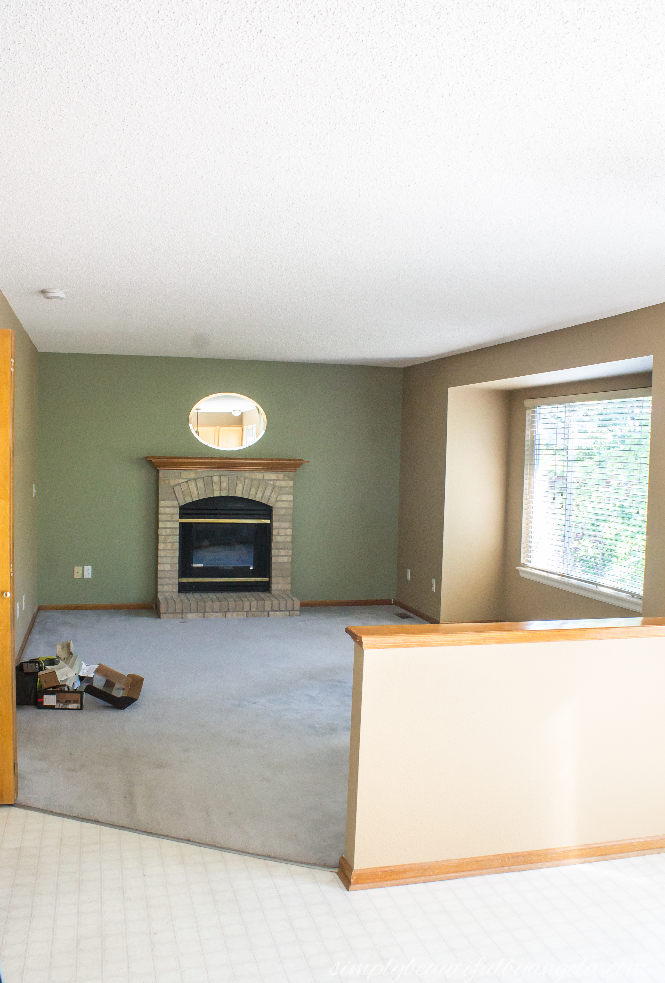
Over the past three years we have knocked down that pony wall, scraped the popcorn ceiling, installed hardwood flooring and painted the walls, all of which really helped update the space.

It is the most popular room in the house and where we spend most of our time together and I’ve been dreaming of doing a full makeover on this space for quite some time.
In addition to adding wall treatments, I’ve been itching to switch up the decor a bit. I planned to keep the farmhouse style but I also wanted to add a few bohemian elements here and there. I created this mood board as an inspiration.
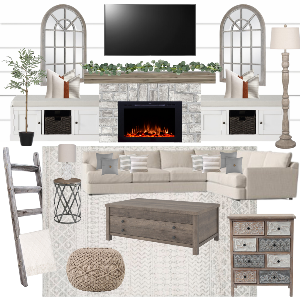
[Mirrors] [Cabinets] [Mantle] [Sofa] [Rug] [Coffee Table] [Garland] [Floor Lamp] [Side Table] [Olive Tree] [Pouf] [Table Lamp] [Gray Pillows] [Striped Pillows] [Throw 1] [Blanket Ladder] [Faux Leather Pillows] [Throw 2] [Chest]
I deviated from these plans a little bit in my shopping choices, but I love how it all came together in the end!



Okay let’s dive into the details of what I did in here starting with the back wall.
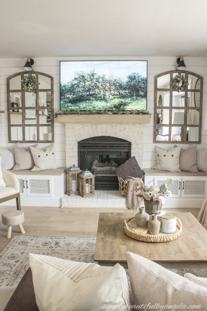
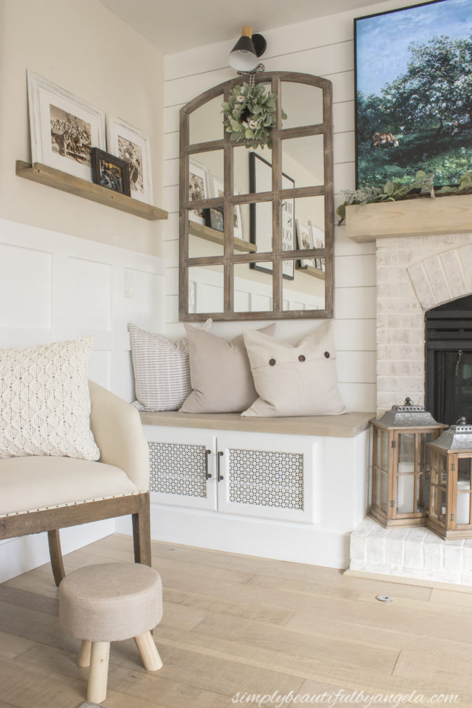
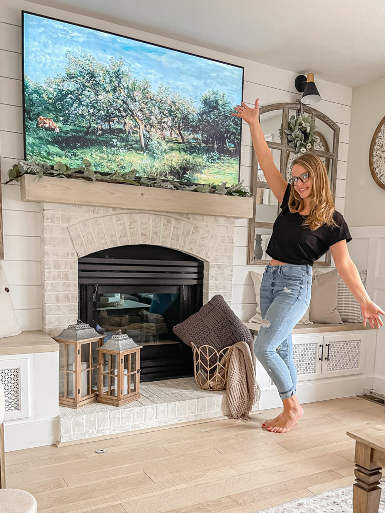
I gave the fireplace brick a German Schmear effect and we also built a new mantel (tutorials on both coming soon). I considered painting the brick, but i am so glad that I went this route instead because I love the cozy aged feeling of this treatment gave the brick.
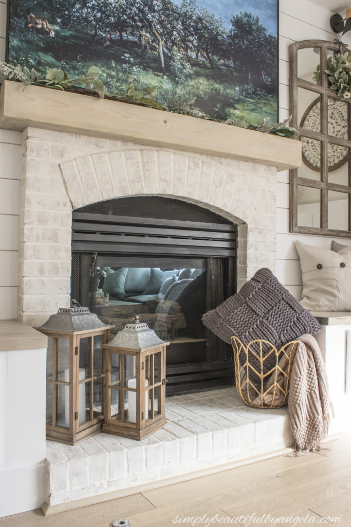
I used common pine boards to build the new mantel and mitered the edges so that the whole thing appears as one solid beam.

We designed and built our own built-in benches on either side using kitchen cabinets, plywood and butcher block. I plan to share a detailed tutorial on those very soon.
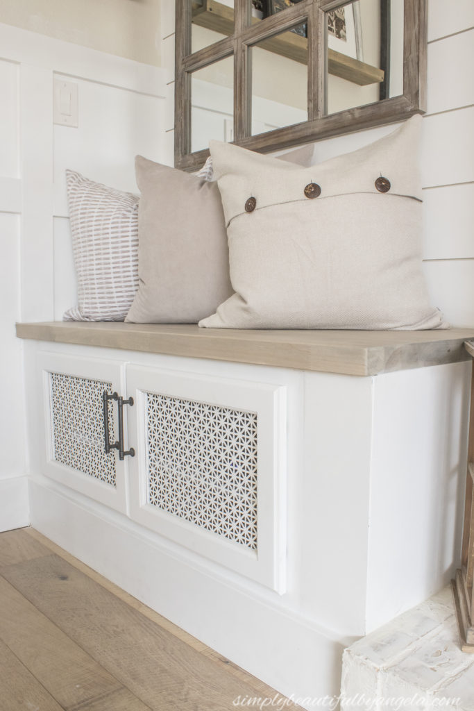
It’s nice to have a little bit of extra seating and storage in this room, but my favorite thing about the built-ins is that they hide all of the electronic boxes!

The reason we replaced the cabinet fronts with decorative aluminum sheeting was so that we could get good air flow inside there for those electronics.

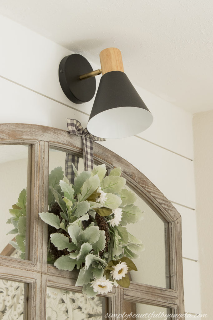
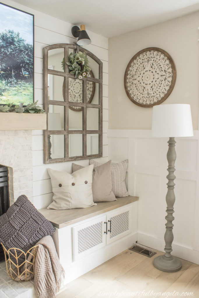
I installed shiplap on the entire wall which is something that I’ve envisioned since the day we first looked at this house. The mirrors stayed since I love the extra light they reflect in the room, but I decided to add some sconce lights above each one for added flair and nighttime lighting.
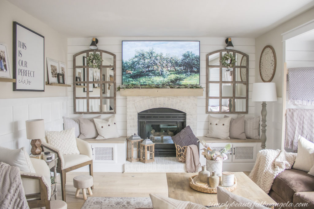
Rather than hardwiring them I simply stuck a battery operated puck light inside each one. I saved us from hiring to have wiring put in and nobody would ever know the difference!
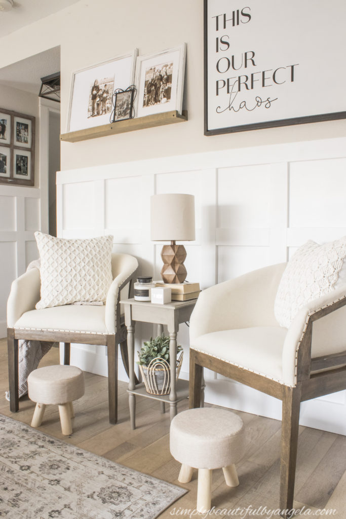
Okay now let’s chat about the wall to the left. I installed board and batten which instantly made it more interesting.

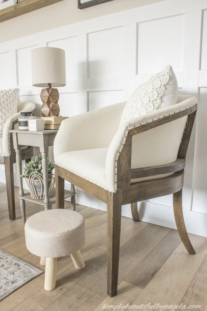
I also took the dresser away and replaced it with two accent chairs and a small table.


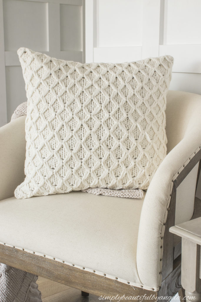
It’s nice to have an extra place to plop down and is such better use of that space than the dresser since we usually just stuffed that dresser full of junk!
I kept the sign because it just sums up our household so perfectly haha. I did take down the shutters and set up the picture ledges in their place and not only does it make the wall feel longer, I also like being able to look at the pictures from the couch.

On the other side of the room is the large window nook. I replaced the old blinds with new bamboo ones which instantly made it feel cozier.
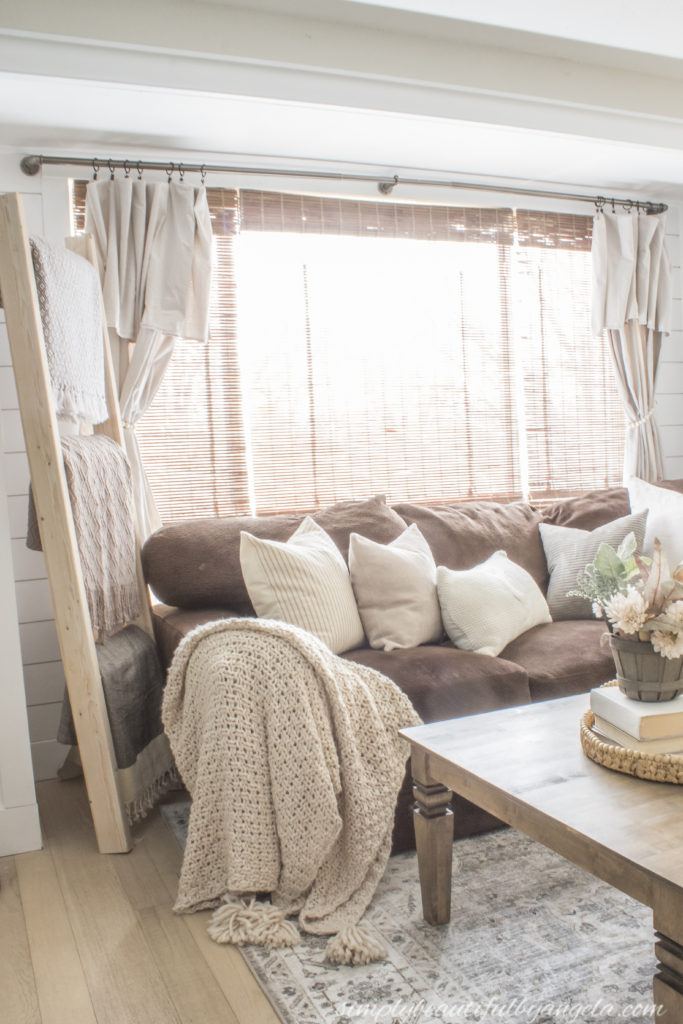
I also installed shiplap inside and trimmed the whole thing with craftsman style trim. I added drop cloth curtains as sort of an afterthought and I am so glad that I did because it’s been nice to have the option to make it darker in here if we are watching a movie.
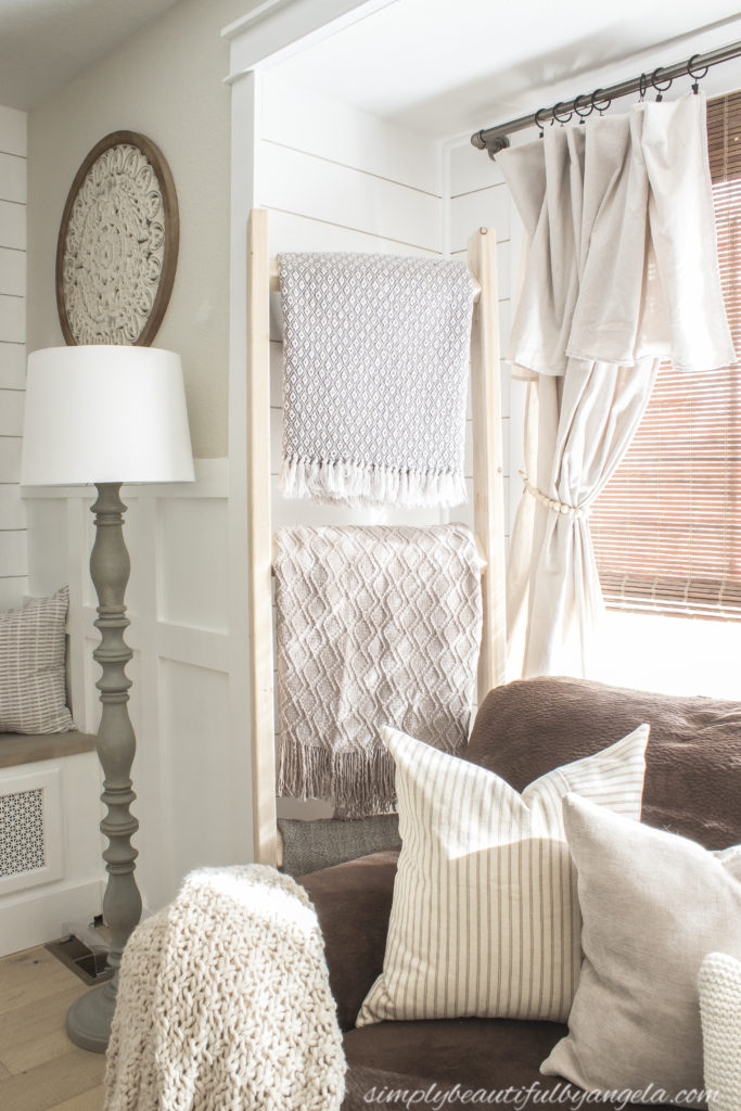
Quick sidenote on the throw that I have draped on this corner–it’s the softest coziest one that I’ve ever owned! It has already become my favorite to snuggle up under.
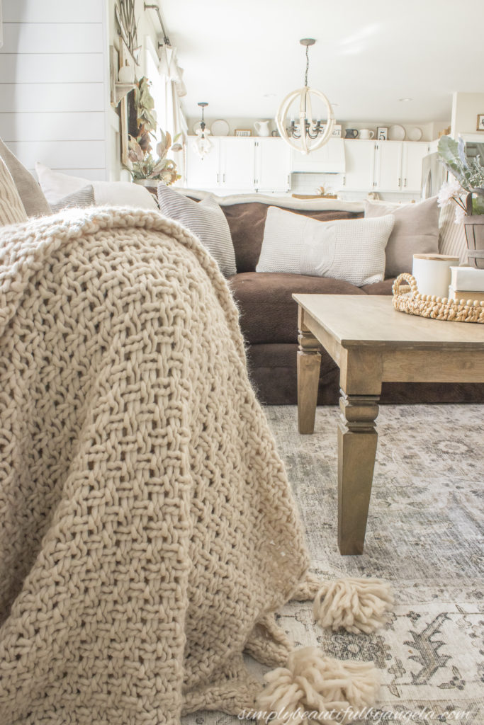
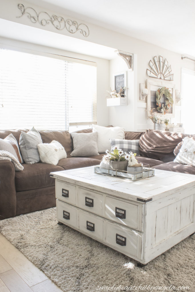
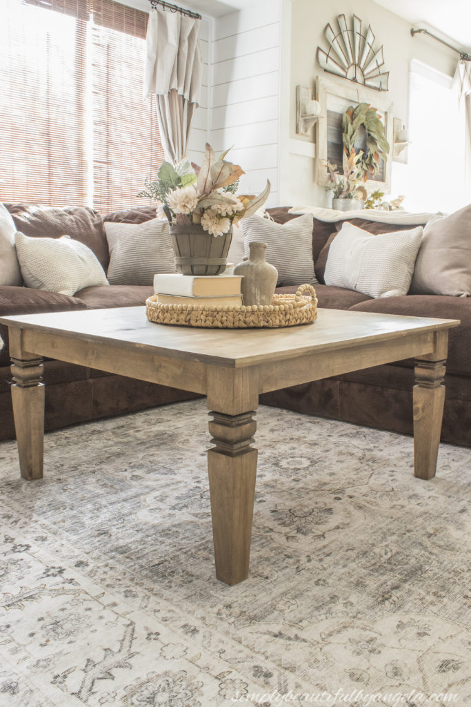
I debated whether or not I wanted to replace our coffee table, especially when I saw how pricey real wood ones can be! However when I found this unfinished option for a steal on Amazon I knew that it would be perfect since I could make it look exactly how I wanted.
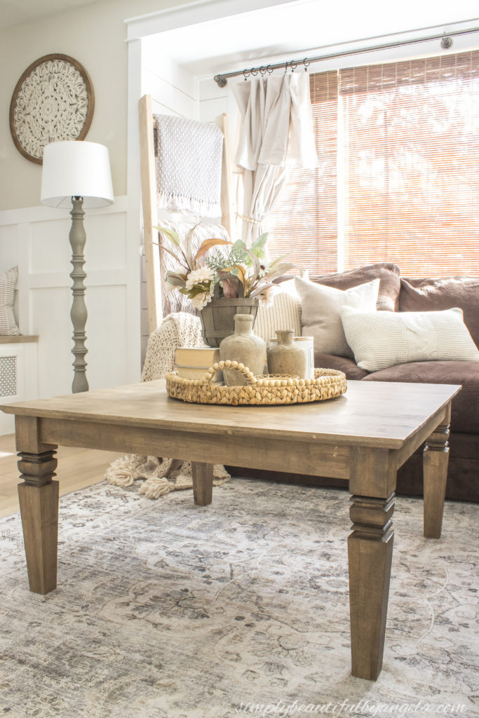
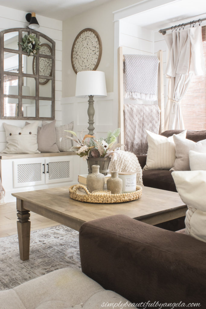
I decided to stain it with Miniwax Espresso and Varathane Weathered Oak and I love how the stain took a little darker in the details on the legs.

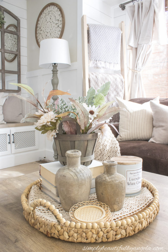
I sealed the top with a matte polycrylic so that I can wipe away stains but I look forward to it getting dinged up over time and creating natural rustic character on it.
One thing that I didn’t question replacing was the rug. The old shag rug that I had in here previously had seen it’s fair share of spills and dirt from the kids and dog and I knew that I wanted to try a washable version.

I was skeptical on quality when I ordered it, but am absolutely smitten with it! It feels just like a normal rug and having the option to throw it in the washer is fantastic. Not to mention it’s gorgeous!
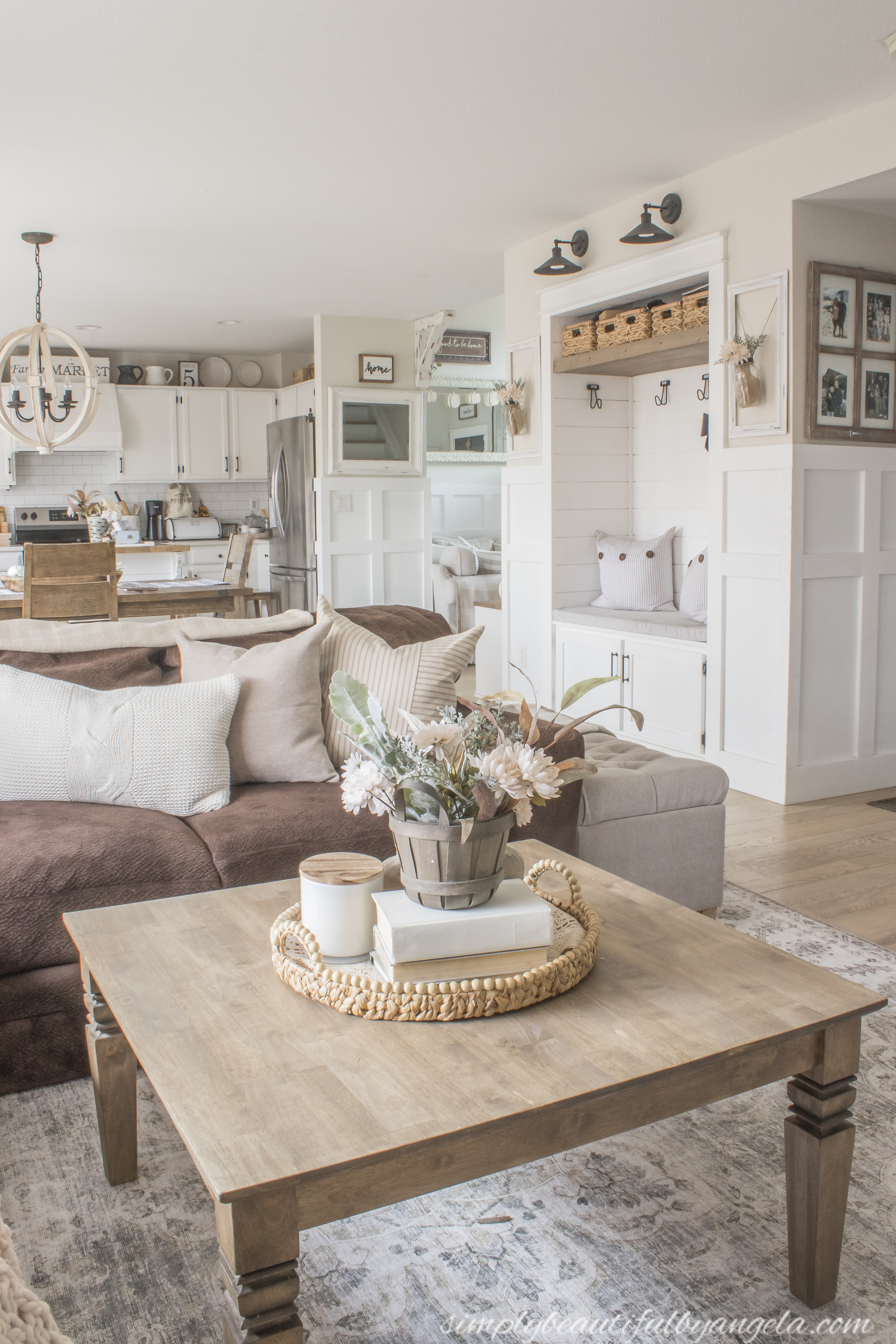
I ordered a new sectional, but due to the fabric going out of stock right after I ordered it sadly didn’t arrive in time for these photos. As luck would have it, it’s actually scheduled to be delivered today haha! I also ordered some floor poufs to go on the end to replace the storage bench so I will be taking some more pictures to share all of that next week.

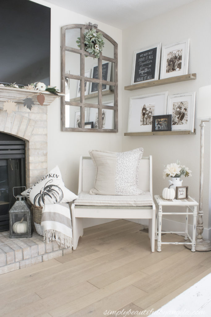
Okay let’s do a couple of before and after comparisons! In case you’re wondering I did remove a piece of the old sectional so that you could get a feeling for how the smaller new sectional will make this space feel.
BEFORE
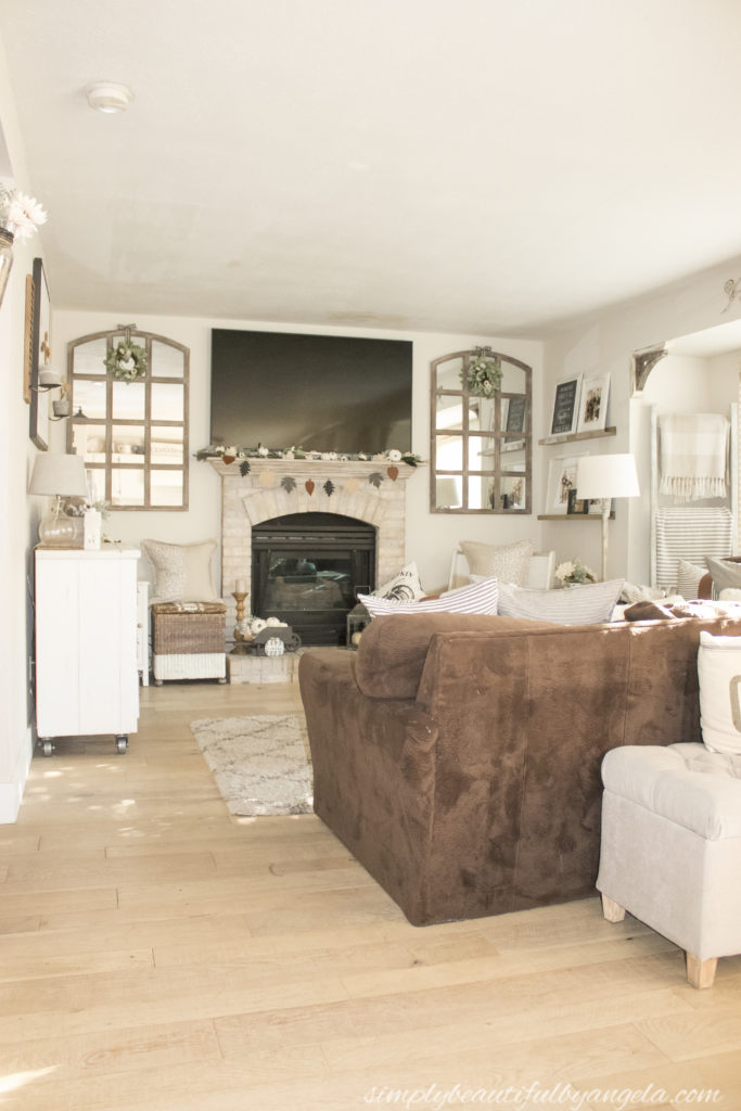
TODAY
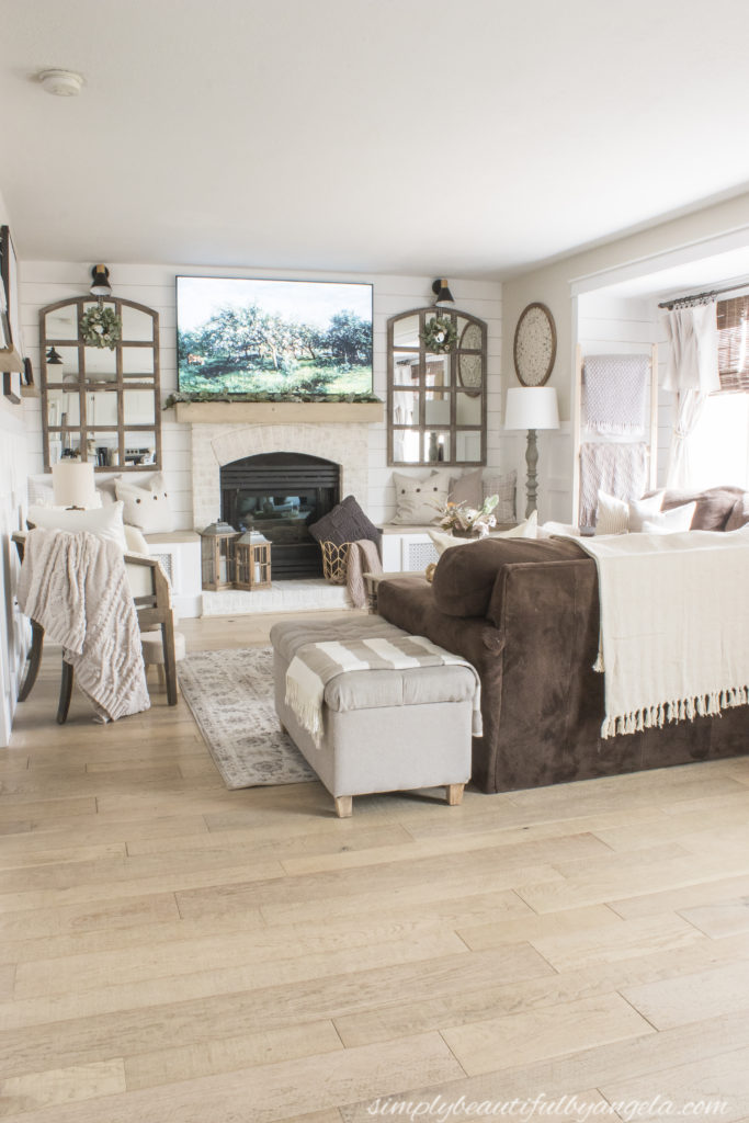
BEFORE
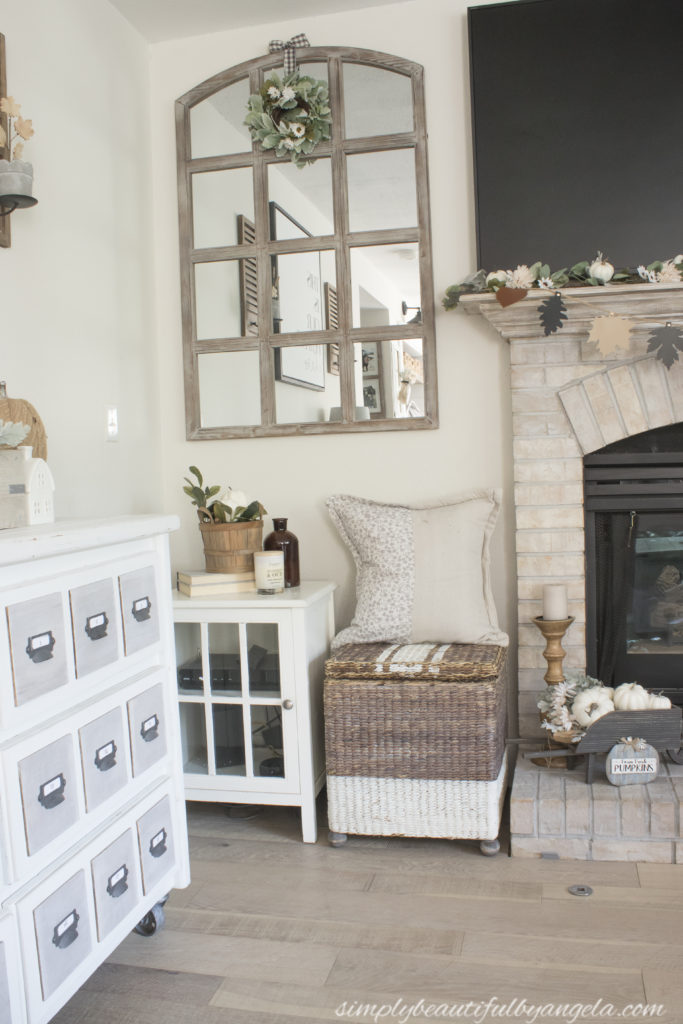
TODAY
BEFORE
TODAY
I am so happy with how it all came together and it was so worth all of the hard work! I am excited to start decorating this space for Christmas in the next coming weeks!
SOURCE LIST:
please let me know if you don’t see something listed
Main Items
- Coffee Table
- Accent Chairs (clearance find, similar)
- Accent Table (Homegoods, similar)
- Storage Bench
- Floor Lamp
- Table Lamp
- Rug
- Wall Medallion
Window
Accents
Throw Blankets
- Chunky Throw
- Chenille Throw
- Herringbone Throw
- Diamond Throw (gray and white)
- Diamond Throw (solid)
- Turkish Throw
- Soft Throw (in basket)
Throw Pillows
- Cream Knit Pillows
- Gray Cable Knit Pillow
- Pleated Pillows
- Button Pillows
- Tan Ticking Pillows
- Taupe Solid Pillows
- Gray Corduroy Pillows
Linking up to these awesome parties
(Affiliate links may be provided for convenience. For more info, see my full disclosure here.)
PIN FOR LATER!
I really love the idea of the benches on either side of the fireplace! I have a couple awkward spaces in my home I’d love to do this with.
I like the windowpane mirrors! And all of your throws look cozy!
😊
Laurie
Ridge Haven Homestead
Homestead Blog Hop
What a gorgeous transformation Angela! I love the matching mirrors and the fireplace turned out amazing. I’ve always wished I’ve had more of the ability to look at something and see what it could be instead of what it is. Obviously, you have more than you’re share and you did an amazing job! Thanks so much for sharing. Happy Thanksgiving!
Very sweet room! What a great transformation!